BRAND IDENTITY
STRENGTH HAS A SIGNATURE
Karabulut Demir Çelik's brand identity is built on the roots of the brand and the meaning carried by the structures it creates. The logo, colour, typography and visual language are designed not only to make the brand recognisable, but also to represent its place in the construction world through steel profiles and structural forms. The common point of the corporate identity is strength, trust and experience.
The navy tone represents confidence and seriousness, while metallic references reflect the technical strength and engineering character of steel. The visual system is designed to remain consistent across projects, vehicles, applications and every customer touchpoint.
LOGO STANDARDS
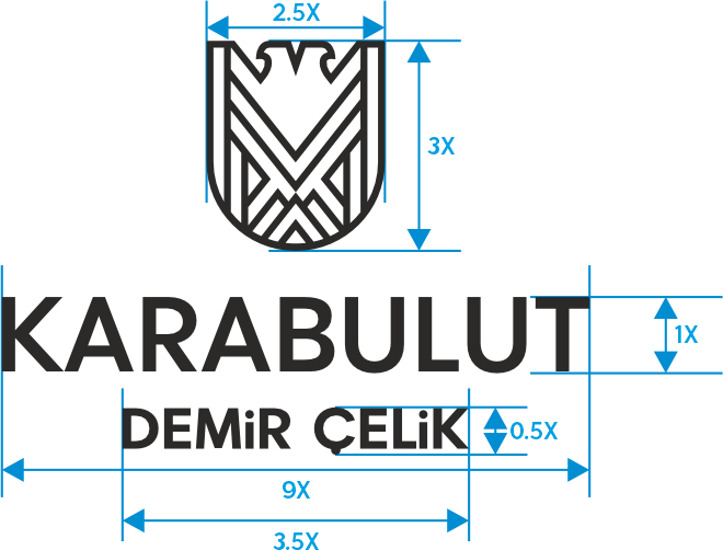
LOGO PROPORTIONS
The horizontal and vertical proportions of the logotype must not be altered and the logo must never be distorted.
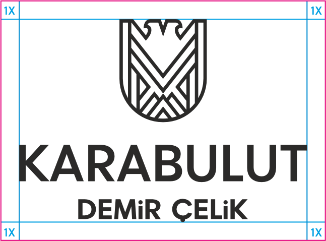
CLEAR SPACE
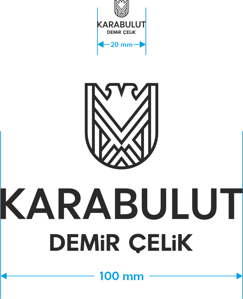
MINIMUM SIZE
COLOUR & BACKGROUND USE
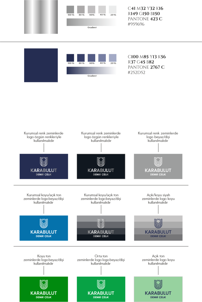
A CONSISTENT IDENTITY BUILDS A STRONG BRAND
A strong visual identity is built by applying the same standards consistently across every surface. The Karabulut identity system defines how the logo, colour palette, spacing and background applications should be used so that the brand remains clear, recognisable and reliable in every communication.
CORPORATE LOGO FILES
Download Karabulut Demir Çelik logo files in approved corporate versions.